Creating charts
You can show data graphically in bar charts, scatter plots and line charts, which are convenient for comparison, analysis or use in reports or presentations.
In Vissim you can display the following data in charts:
- Data containing the characteristics of your Vissim network, such as base data or attributes of network objects. This includes data from user-defined attributes.
- Data arising from simulations, such as result attributes from result lists
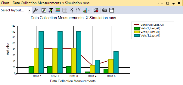
Example bar chart, line chart
As an example, the figure shows the recorded number of Vehicles from three simulation runs as bars for five Data Collection Measurements, and the average measured number of vehicles over the three simulation runs is plotted as a line (Quick start guide Creating a chart), (Creating line charts or bar charts without preselection):
Scatter plots
Scatter plots are particularly useful for visualizing the correlation of data from a network object, for example, to compare the values of two different result attributes or to quickly perform qualitative comparison of multiple data series (Creating a scatter plot). Data of a current scenario and a comparison scenario cannot be displayed in a scatter plot.
Examples
- Fundamental diagram: you compare the traffic flow Q (number of vehicles in the time interval) with the average speed (averaged speed of all vehicles in the time interval) recorded by Vissim in the network during the simulation. You have recorded the values with the link evaluation based on link evaluation segments and time intervals. For each time interval, a point is created in the scatter plot.
- Calibration: You display selected result attributes of several simulation runs in the scatter plot and compare them with measured data to identify and assess differences. For example, you can compare the capacity of an intersection or junction with the volume of traffic in the major traffic flow, or you can display queue length and delay at an entry or visualize the number of vehicles and delay in the Vissim network as part of a dynamic assignment.
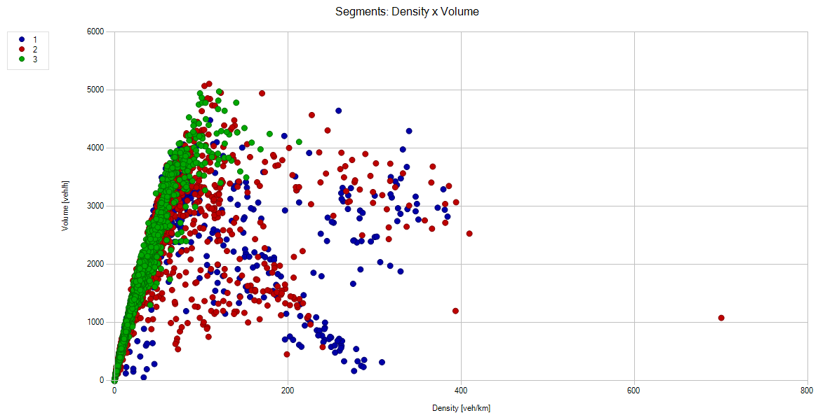
The figure shows an example of the Density (Density (All)) compared with the Volume (Volume (All)) from the link evaluation based on link evaluation segments. The entry Simulation runs for the Data series allows the comparison of results from the three simulation runs. Vissim automatically assigns the points of each group of the data series the same color:
Superordinate topic:
Information on editing:
Quick start guide Creating a chart
Creating charts with or without preselection
Related topics:
