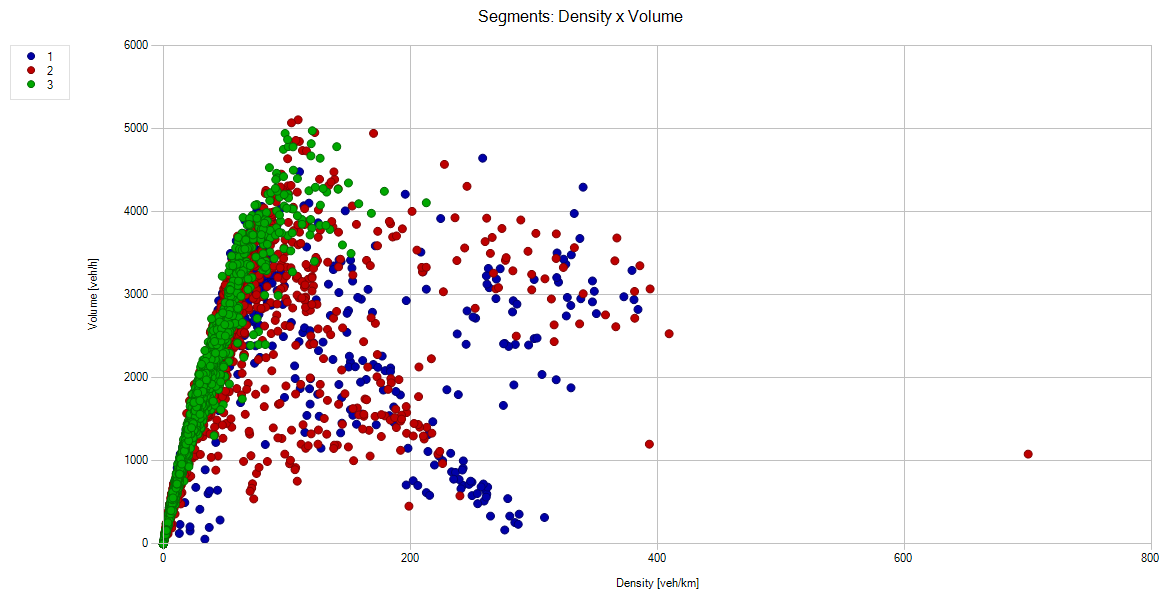
Creating a scatter plot
For a scatter plot, you select a network object type and an attribute from it, whose values are plotted on the x-axis and the y-axis. You can display the values as a Data series using another dimension: By selecting time interval, simulation run, class of vehicles or pedestrians as data series, you form the groups for the visualization whose data you want to compare with each other. The points of each of these groups are displayed in the scatter plot with the same color.
Scatter plots cannot be combined with bar charts or line charts.
1. On the View menu, click > Create Scatter Plot.
The Create scatter plot window opens.
![]()
2. On the Data Assignment tab, select the desired data:
|
Network object type list box |
Network object type from which you want to select two attributes for display in the scatter plot |
|
X-axis, Y-axis |
|
|
Data series |
Select the entry you want to use as a basis for forming the groups whose data you want to compare. This forms the basis for different colors, shapes as well as the legend. |
 : attribute and/or subattribute whose values are to be displayed
3. If desired, further restrict the data based on the criteria on the Filter / Aggregation tab:
|
Network Objects |
|
|
Simulation runs |
|
|
Time intervals |
|
|
Classes |
|
A chart preview is displayed when data has been selected in the area on the right and the data selection is valid.
4. To apply a named chart layout in the chart, in the Named layout list box, click the desired entry (Using named chart layouts).
5. Confirm with OK.
The Create scatter plot window closes. The Scatter plot <title> window opens in the Vissim GUI. The scatter plot is displayed. Example: