Presenting data
Depending on your requirements for comparability or data analysis, you can create the following charts:
- Line chart
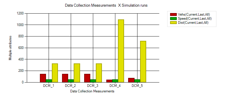
- Bar chart
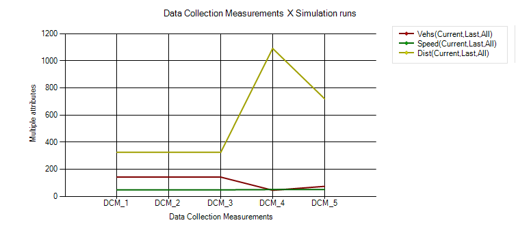
For the display in the chart, select the desired network object type, base data type or result data type as well as at least one object of the selected type and one attribute of the object. The attribute values are plotted on the vertical y-axis (Quick start guide Creating a chart), (Creating line charts or bar charts without preselection).
You can also combine a line chart with a bar chart by using the data series graphic parameters (Adjusting how the chart is displayed).
- Scatter plot (Creating a scatter plot)
For the display in the scatter plot, select the desired network object type, base data type or result data type as well as an attribute of this data type whose values are to be plotted on the x-axis and the y-axis. You can further restrict the selected attributes using Filters and Aggregation. Scatter plots cannot be combined with bar charts or line charts. The data is displayed as points of a scatter plot. By selecting an entry for the Data series, you create the basis for forming the groups whose data you want to compare. This forms the basis for different colors, shapes as well as the legend in the scatter plot. Vissim automatically assigns the points of each group of the data series the same color.
Dimension on the x-axis of line chart and bar chart
The objects from one of the following dimensions are plotted on the x-axis. Select the desired dimension, which for the chosen network object type, base data type or result data type determines whether network objects, attributes, simulation runs, time intervals, vehicle types or pedestrian types are plotted on the x-axis. Then choose the objects in this category to be plotted on the x-axis.
You can choose from the following dimensions and objects in these dimension:
- Network objects: You must choose at least one object of the selected network object type, base data type or result data type. You can select an option to choose all objects of the selected network object type, base data type or result data type.
- Attributes: You must choose at least one attribute for the selected object or objects.
- Simulation runs: If you have performed simulation runs, you can choose the desired simulation runs to be used as data sources for the chosen objects and chosen attributes in the chart. You can also select an option to use the data from all simulation runs.
- Time intervals: If time intervals are available, you can choose the intervals to be used as data sources for the chosen network objects and attributes in the chart. You can also select an option to use data from all time intervals.
- Vehicle classes or Pedestrian classes: You can choose vehicle classes or pedestrian classes to be used as data sources for the chosen network objects and attributes in the chart. You can also select an option to use data from all vehicle classes or pedestrian classes.
Attribute values on the y-axis of line chart and bar chart
On a bar chart the height of the bar corresponds to the attribute value of the object plotted on the x-axis. If you have chosen several attributes for the objects on the x-axis, a bar for each attribute is shown on the bar chart. The bars are distinguished by a different color for each attribute.
On a line chart the vertical position of the data point corresponds to the attribute value of the object plotted on the x-axis. The data points of multiple objects are connected by a line.
For data in percentages, Vissim divides the y-axis into segments from 0 to 100. If the data of only one attribute is shown in percentages, the unit [%] is added to the y-axis labeling.
Presentation of data during an active simulation
If a chart containing dynamic data is displayed during an active simulation, the chart shows the data at each time step. As a result, the chart can change continuously as long as the simulation is running.
Superordinate topic:
Information on editing:
Quick start guide Creating a chart
