1. In the network display, select the network object for which you want do display a column chart.
2. Right-click in the network display.
A shortcut menu opens.
|
Tip: Alternatively, select a network object in an open list and right-click it to open its shortcut menu (Working with lists). |
3. Select the Column charts entry.
The Column chart for <network object, number> window opens.
4. Click the Settings button.
The Graphic parameters: Column chart for <network object, number> window opens.

5. Make the desired changes.
|
Note: The settings apply to all column charts of the network object type. You can thus specify just one display per network object type. |
|
Element |
Description |
|
Charts |
Here you can specify the number of charts for the selected network object type. Note If you insert several rows, the individual charts are displayed one below the other. Name You can enter a name for each chart if you double-click in the respective row. Note In the display, the name is displayed as chart title. Create Use this button to create a row for a new chart. Delete Use this button to delete the selected row. Note If you create more than one row, the following settings apply to the selected row/chart. |
|
X-axis |
You can select one of the following options in order to display one or several column charts. One column per network object If the option has been selected, you can select the network object or a relation in a separate window when clicking on the button. Tips A multi-level selection is possible. The set union of all objects is then selected. You can, for example, select the relation Origin connectors/Node/In Links of Zones. This means that the set of all incoming links at all connected nodes has been selected. You can thus, for example, display all volumes of the incoming links at a specific node. One column per analysis time interval If the option has been selected, the chart displays one column per time interval for one or more attributes. Notes This option facilitates the graphical display of the temporal course of, for example, volumes at links, stops, lines and so on. Each attribute is displayed as a separate row. Label x-axis Enter a text which will be displayed at the x-axis of the chart. Label X-values You can select an attribute of the chosen network object type in a separate window when clicking the button. Notes The columns are labeled with the attribute value at the x-axis. The option is only available if the One column per network object option has been selected. If the One column per analysis time interval option has been selected, the x-axis is labeled with the currently existing analysis time intervals. |
|
Y-axis |
Here you can specify the value range and the attributes which you want to display. Min value Minimum value displayed at the y-axis Max value Maximum value displayed at the y-axis Create Use this button to create a row for a new attribute. Note You can create as many attribute rows as you like. Attribute In this column, you can select an attribute which you want to display when clicking on the button. The button is labeled with the selected attribute. Color You can select a color for the display of the attribute values in a separate window when clicking the button in the Color column. Delete Use this button to delete the selected attribute row. |
|
Draw legend |
If the option has been selected, next to the respective chart, a legend features the short names and the colors of the displayed attributes. Note You need to set the option separately for each chart. To do this, select the desired chart in the list of the Charts section. |
|
Note: If you click the Preview button, your changes show immediately in the column chart without the Graphic parameters: Column chart for <network object, number> window being closed. If the column chart is not visible, move the Graphic parameters window with the mouse. |
6. Confirm with OK.
The column chart is displayed according to your chosen settings.
|
Notes: If you make changes to the network or the time intervals, the column chart is refreshed. The parameter settings of the column charts are saved with the version file and with the graphic parameters file. |
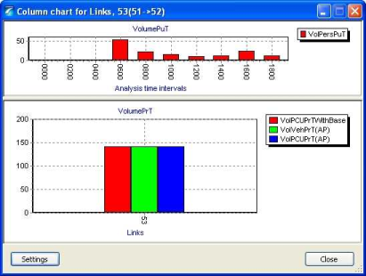
Example of a column chart
The settings pictured in the Graphic parameters: Column chart for link 53 (51>52) window yield the following column chart.
|
Note: Horizontal dividers separate the individual charts. You can change the proportions of the charts if you drag the divider. |
