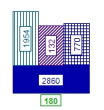
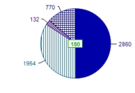
Attributes of network objects can be displayed as column charts or pie charts at the coordinates of the name.
1. On the Graphics menu, click Edit graphic parameters.
The Edit graphic parameters window opens.
2. For line objects make sure, that in the <Network object type> tab the option Draw label has been selected.
3. Make sure that the chart display has been enabled for the desired network object type and status:
- Point object: Navigator entry <Network object type> > Display > desired tab > option Draw chart > is selected.
- Line object: Navigator entry <Network object type> > Label > Display > option Draw chart > is selected.
|
Note: For classified display of a network object type, define by class whether charts are to be displayed. |
4. In the navigator, select the desired entry:
- Point object: Navigator entry <Network object type> > Chart
- Line object: Navigator entry <Network object type> > Label > Chart
5. On the General settings tab, make the settings of your choice.
|
Element |
Description |
|
Draw chart |
If the option has been selected, the network objects are labeled with charts. |
|
Column chart |
If the option has been selected, a column chart is displayed. |
|
Pie chart |
If the option has been selected, a pie chart is displayed. |
|
Column width |
Here you can specify the width of each column. Note This option is only available for column charts. |
|
Display negative values |
If the option is selected, negative values are displayed with the absolute value. Note This option is only available for pie charts. |
6. Use the icons to add the desired elements to the chart.
|
Notes: The procedure for inserting the elements of a chart is almost identical to the procedure for inserting bars (Defining one or multiple bars). You can use a chart to display different attribute values. In addition to the size of a pie chart or column chart, the color of each chart element can also be defined by an attribute value. For example, a pie chart can be scaled according to the number of passengers alighting and colored according to the average risk of delay. For a classified display of the color, activate the check box for the Classified display column and make the desired settings for the classification in the Display column (Setting up classes and class limits for classification). |
7. On the Scaling tab, make the desired changes.
|
Element |
Description |
|
Use uniform scaling |
If the option is selected, a uniform scaling is applied to all columns. Note This option is only available for column charts. |
|
Maximum column height / pie area |
Maximum column height / pie area in mm/mm² |
|
Manual scaling |
If this option has been selected, you can define the value range by chart: Enter the absolute values for the chart display. The upper limit is displayed by the maximum column height or pie area. The chart width is identical for a chart representing a negative attribute value and a chart representing the respective positive attribute value. The scaling range has to be adjusted accordingly: For attribute values in the range between -200 and +100, enter 0 - 200 as scaling range. If the attribute value of an object is less than the lower scaling limit, the chart will not be displayed. If the attribute value of an object is greater than the upper scaling limit, the chart will be displayed in the maximum width/area. Notes For the optimum display of the chart, you should adjust the input limits to the displayed minimum and maximum values. Negative and positive values can be distinguished by the fill color. |
|
Automatic scaling |
If the option has been selected, the value range goes from 0 to the calculated Network maximum that has been determined from the attribute values and which is multiplied by a user-defined factor between 0.0 and 1.0. |
8. On the Text format tab, make the settings of your choice.
|
Element |
Description |
|
Draw label |
If the option has been selected, the charts are labeled. |
|
Font |
You can specify a Font and a Style in a separate window by clicking in the field. |
|
Text size |
Size of the label in mm Note Texts which are longer than the column height are displayed above the column. Texts which are higher than the column width are not displayed. |
| Label color like column / pie |
 If the option has been selected, all labels have the same color as the corresponding column / pie. If the option has been selected, all labels have the same color as the corresponding column / pie.
|
| Uniform label color |
Use the selection list to select a color for the labels. |
|
Draw text frame |
If the option has been selected, you can specify settings for a text frame in a separate window. |
 If the option has not been selected, you can specify a consistent color for all chart labels.
9. Confirm with OK.
The charts are displayed at the network objects according to your settings.
