You can create column charts with values of direct and indirect attributes (Attributes) from the network editor, for individual network objects (Creating column charts). You can create common chart displays directly from Visum, without having to export list contents to Excel, to create the graphics there.
There are two standard types of column charts:
- Column charts for time intervals: If you have defined time intervals (Spatial and temporal correlations in Visum) in your model, you can display an attribute for each time interval, for a network object. This function especially supports you when analyzing dynamic assignments. The Image 269 shows a column chart, for which three columns with the passenger volume for the entire PuT, the tram and the bus are drawn for a link, for each time interval.

Image 269: Column charts for time intervals
- Column charts for relations between network objects. For a network object (for example stop), you can display attributes, linked via the Visum data model network object (for example the stop points of a stop) as column charts. In Image 270, a column chart was invoked for the stop Durlacher Tor and a column was drawn for each network object stop point. As you can see, the stops are assigned three stop points, for which each the number of boarding passengers, alighting passengers and transfers is displayed as a column chart.
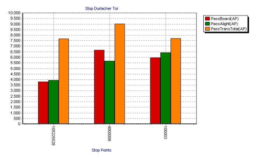
Image 270: Column chart for relations between network objects
