Using stop catchment areas, you can draw circles around the stops, to graphically display the public transport development quality in the network (User Manual: Displaying stop catchment areas in the Network editor window). The circle can either be drawn with a constant radius or in proportion to the values of direct or indirect stop attributes. Circles were drawn with a constant radius of 400m in the example in Image 259. As you can see, the Eastern part of the small town is insufficiently accessible by PuT, so that the extension measures should aim towards making this territory more accessible.
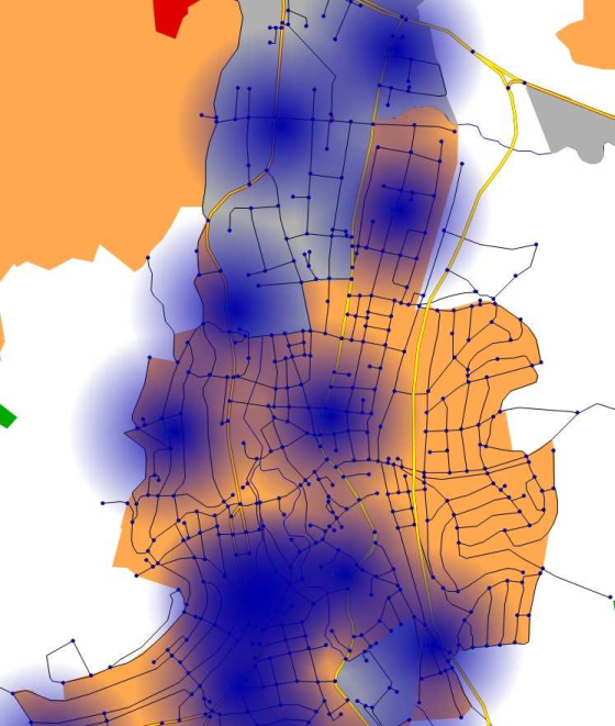
Image 259: Stop catchment areas with a large radius of 400m
Stop catchment areas can also be drawn classified. In Image 260 catchment areas with a radius of 300m are drawn around the stops. The circles of stops with more than 1,000 departures per analysis period are red, stops with less than 500 departures are orange, and stops with less than 100 departures are displayed in green. This is how you can display how strongly stops are frequented and how the entire network is made accessible by PuT, in a graphic.
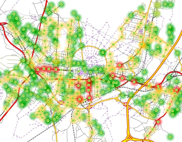
Image 260: Stop catchment areas classified according to the number of departures
